Inspiro Main menu for mobile users

Hi, I am existing customer using Inspiro.

I sometimes mention my blog to people and they load it on their phone.
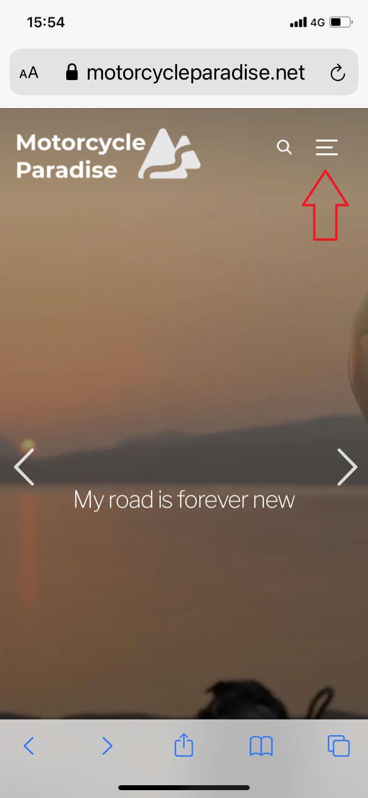
Most times I note they cannot find how to access the main menu and the sites content.
i.e. the small 3 lines (hamburger) icon on top right of screen seems unknown to them to be the menu.

Over 50% of my visitors are now using a mobile phone to view and in feedback am getting asked do I have further info about something then when I say it is in a certain section they tell me they had no idea there was all other sub menus.

I’m seeking suggestions for what I might do. I added a link in footer to a page that has a graphical tour of how to access menus on a phone but really I need something better than that 3 line icon which nobody seems to know is the menu or a way they can easy see to get to main menu.

Hi Warren,

Do you think it would be better to have a small text saying “Menu” under the 3 lines?

image

You can achieve something like this by adding this CSS code in the Customizer > Additional CSS:

@media screen and (max-width: 1020px) {
  
  .inspiro--with-page-nav .navbar-toggle:after {
      content:"Menu";
      display: block;
      color: #fff;
      font-size: 12px;
      margin-left:-7px;
      margin-top: 3px;
  }


  .inspiro--with-page-nav.side-nav-open  .navbar-toggle:after {
      content:"Close";

  }

}

Hi Pavel,

I think that is perfect.
I have applied that now and think this will assist my visitors who either overlook or are not familiar with the hamburger icon.

Thank you.

I added the code in css but there was no effect hamburger still shows as 3 lines