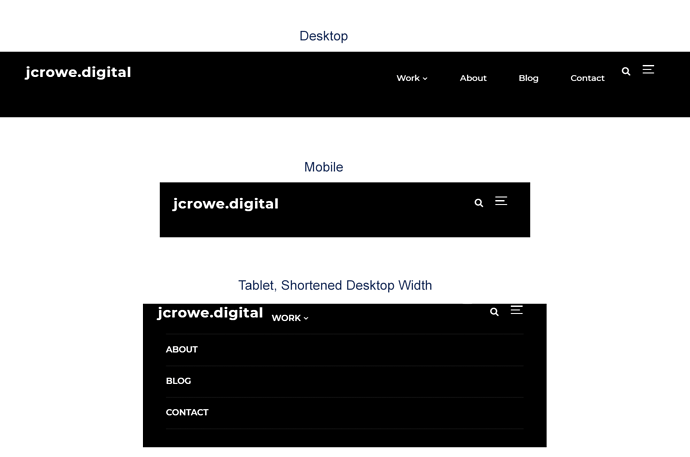
I just noticed this recently when viewing my site on an iPad. It seems that as the horizontal resolution shrinks, my main menu will wrap around the site title before it disappears in “mobile” viewing mode. However, because there is a fixed resolution on tablets, it displays wrapped by default. This makes the menu difficult to use, especially because there’s a submenu within it.
Is there a way to prevent the menu from wrapping and just go immediately to “mobile” mode when it reaches that threshold?
I’ve included an image to show my issue.

